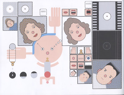
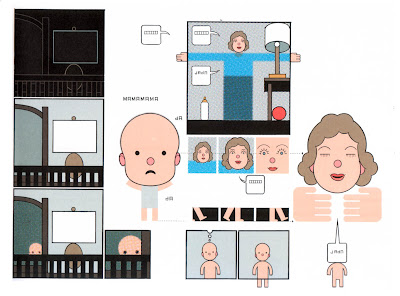
Here's a link to the "sig" templates:
http://www.box.com/s/esdnbnxkj0ljxze6mi75
Specs:
1 column is 14 picas (2.375 in)
So if you're going for a half-column sig, it will be 7 picas across
It will ultimately be 300 dpi
CMYK
Black must be 100% K
Dot gain is 30%, so it needs to be lighter than you think.
Subheads should be in Myriad Pro.
Here are the hex color values for the "Core Themes":
Green: #86a659
Beige: #bab79b
Black: #231f20
Blue: #3e7ca3
Thursday, January 26, 2012
Tuesday, January 24, 2012
Assignment for Thursday
For Thursday, come to class with 5-10 sketches for the "sig" or icon you're working on for the paper. This is who got what:
What's Going Down Around Town
Victor
Brett
Art Shows
Jesica
Dylan
Travel
Chelsea
Carrie
Profiles
Maggie
Matt
Cooking for College Students
Nick
Michelle
2012 Election
Keith
Ethan
What's Going Down Around Town
Victor
Brett
Art Shows
Jesica
Dylan
Travel
Chelsea
Carrie
Profiles
Maggie
Matt
Cooking for College Students
Nick
Michelle
2012 Election
Keith
Ethan
Sunday, January 22, 2012
Brief assignment: RIP! Response
For Tuesday's class, as a way of bouncing off the documentary we saw, "Rip! A Remix Manifesto," please bring to class an example of a work of art that you like (music, visual art, writing, whatever), and also bring a work that somehow inspired or influenced that work. This is just to build on the idea put forth in "Rip!" that art builds on previous art – that culture builds on the past.
One example I'll show in class is J Dilla's "Lightworks":
Which lifts heavily from a Raymond Scott tune:
With a bonus look at Chris Ware's "Lint":
Which is a response to James Joyce's "Prtrait of the Artist as a Young Man," which begins:
One example I'll show in class is J Dilla's "Lightworks":
J Dilla - Lightworks from James Works on Vimeo.
Which lifts heavily from a Raymond Scott tune:
With a bonus look at Chris Ware's "Lint":


Which is a response to James Joyce's "Prtrait of the Artist as a Young Man," which begins:
Once upon a time and a very good time it was there was a moocow coming down along the road and this moocow that was coming down along the road met a nicens little boy named baby tuckoo… His father told him that story: his father looked at him through a glass: he had a hairy face. He was baby tuckoo. The moocow came down the road where Betty Byrne lived: she sold lemon platt.
Monday, January 16, 2012
Welcome
Welcome to the blog for the Intermediate/Advanced Digital Darkroom class.
Your first assignment, starting today, is to make an icon for yourself – something that could be displayed on a smart phone or tablet device. We'll be using illustrator to create the icon – it'll give us a change to brush up on the illustrator interface. The icon could literally be for yourself – as if I were to make a "Chris Lanier" icon – or it could be for a service you provide, or for a fictional app you could imagine developing.
Here are a few references we'll look at:
How to Design App Icons for iPhone and iPad
Official Apple iOS guidelines
Illustrator icon tutorials:
Design Float Circle Icon
How to Create a Vector Safari Compass in Illustrator
The icon should be bold enough that the image is comprehensible at 29x29 pixels, the minimum display on an iPhone "spotlight search." When officially making an icon for use in the iOS, you don't need to create the "sheen" or the rounded corners, but for the sake of this exercise, I'd like you to include those design details.
If you'd like a syllabus, you can download the "advanced" one here:
http://www.box.com/s/glhpxqgmpsdth5lh2he1
And the "intermediate" one here:
http://www.box.com/s/j8hispbi6nol1vi84ynf
Subscribe to:
Comments (Atom)