At the beginning of class on Tuesday, you need to have three things done:
1. Your tweaked, finalized six interior pages for the lulu book, exported as a pdf with the bleeds included (to include the bleeds in the export, when you go File >> Export, export it as a an Adobe PDF (Print), and in the dialogue box that appears, from the options on the left, you can choose "Marks and Bleeds." Once you click on that, there is a "Bleed and Slug" dialogue box, and in that, check the box for "Use Document Bleed Settings." That should export the pages with bleeds.
IMPORTANT NOTE: I actually goofed up when mentally converting inches to picas when I gave you the bleed settings for your InDesign document. 1p5 is not an eighth of an inch, it's a quarter inch. And unfortunately the picas setting in InDesign doesn't seem to recognize 0p75 (which would be an eighth of an inch) as a valid value. So you'll need to convert your InDesign document settings to inches, and then set the bleed as an eighth of an inch. to do that, in InDesign, go to "inDesign" in the top left menu, like so:
InDesign > Preferences > Units and Increments
And in the dialog box, select the horizontal and vertical ruler units as inches instead of picas.
After that, in the upper menu, go:
File > Document Setup, and in the bleed section, set the bleeds to .125 inches
Then you should be good to export with bleeds.
2. Your finished cover art for the book -- "The Lunch Box." This should be sized to 8.75in x 8.75in (the book is 8.5x8.5, so this includes and eighth of an inch bleed). You should own all the rights to the images you use on the cover.
3. I want you to bring in some example of an ad or page layout that you find, in a magazine, a book, or online, that you can step us through in terms of how you think the image was put together -- what settings in Photoshop, Illustrator, or InDesign were used? On Tuesday, I'll have you present the image, an verbally walk us through a kind of "reverse engineering" process for it.
Showing posts with label class-assignment. Show all posts
Showing posts with label class-assignment. Show all posts
Thursday, March 29, 2012
Thursday, March 22, 2012
Recap on a couple of the InDesign tips
Spellcheck in InDesign is located under the "Edit" menu: Spelling : Check Spelling
To adjust hyphenation settings, select the text you want to adjust the setting for, and then under the "Window" menu: type and tables: paragraph
Once the paragraph menu is open, click the little triangle in the upper right corner, and in the submenu that appears, click hyphenation. That gives you access to hyphenation parameters and the hyphenation slider.
AND A REMINDER: you six lulu pages are due at the beginning of Monday's class.
Thursday, February 9, 2012
Assignment for Tuesday (2/14)
For Tuesday, I want you to come prepared with images for our next project – a "composite drawing."
This project will be a tracing/drawing project, in which you'll composite two photos, and then use the composite as a basis to trace out an illustration. You won't have to composite the two photos perfectly -- since you're ultimately making a drawing, you can correct discrepancies of lighting at the drawing stage, and a lot of the tell-tale details that you need to painstakingly correct when making two photos seem like one realistic photo can just be omitted at the drawing stage.
The theme for the drawing will be to take some figure or object and put it somewhere it doesn't belong. It could be a godzilla-size dog stomping through a skyline, a bird perched in an aquarium, someone practicing yoga at the top of a flagpole. The more impossible the better. The final drawing should be 11 inches by 17 inches, 300dpi -- it doesn't matter if it's in portrait or landscape format. Please come prepared with your photographic images at the beginning of next class -- if you want to shoot your own photos for this project, feel free.
The Sierra Nevada Review is also looking for images for their front cover, and as it happens, the aspect ratio for the front cover is the same (the dimensions are 5.5"x8.5", which is an 11x17 aspect ratio – adding a 1/8" bleed would be ideal). We'll be printing out stand-alone posters, but leave room to place the title of the Sierra Nevada Review ("Sierra Nevada Review 2012") on the image as a cover treatment – which we'll submit to the magazine.
To look at Jessica's cover for the Review last year, click here (note that she did a wrap-around cover, which you don't have to do – you can just worry about the front cover image).
Sunday, January 22, 2012
Brief assignment: RIP! Response
For Tuesday's class, as a way of bouncing off the documentary we saw, "Rip! A Remix Manifesto," please bring to class an example of a work of art that you like (music, visual art, writing, whatever), and also bring a work that somehow inspired or influenced that work. This is just to build on the idea put forth in "Rip!" that art builds on previous art – that culture builds on the past.
One example I'll show in class is J Dilla's "Lightworks":
Which lifts heavily from a Raymond Scott tune:
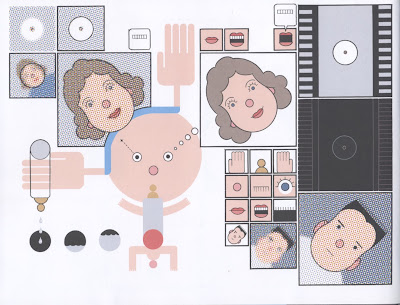
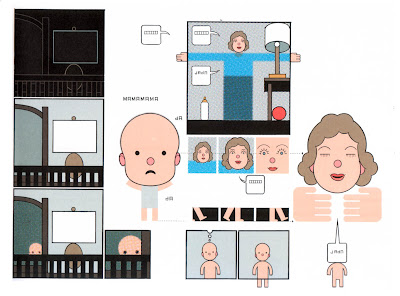
With a bonus look at Chris Ware's "Lint":


Which is a response to James Joyce's "Prtrait of the Artist as a Young Man," which begins:
One example I'll show in class is J Dilla's "Lightworks":
J Dilla - Lightworks from James Works on Vimeo.
Which lifts heavily from a Raymond Scott tune:
With a bonus look at Chris Ware's "Lint":


Which is a response to James Joyce's "Prtrait of the Artist as a Young Man," which begins:
Once upon a time and a very good time it was there was a moocow coming down along the road and this moocow that was coming down along the road met a nicens little boy named baby tuckoo… His father told him that story: his father looked at him through a glass: he had a hairy face. He was baby tuckoo. The moocow came down the road where Betty Byrne lived: she sold lemon platt.
Subscribe to:
Posts (Atom)